
A Conversation with Nell Brookfield

Nell Brookfield is a London-based artist. She received a BSc in anthropology at University College London before pursuing her arts education at the Royal Drawing School in London. Later, she started an MFA in painting at the Pratt Institute in New York, New York. In this interview, Brookfield speaks to her career, her inspirations, and her first solo exhibition at Eve Leibe Gallery in London, You Are What You Eat.
Rebecca Boss: Tell me more about your background — where and how did you grow up? What led you to a career in art?
Nell Brookfield: After studying anthropology in London and working for a brief time in photography in NYC, I found my way to The Royal Drawing School, a school in East London purely focused on drawing. Each year they offer thirty places in “The Drawing Year,” a postgraduate program that aims to build up drawing as a muscle. You do this by observationally drawing all day, everyday; in the park, the pub, the cinema, in galleries, the life room, your studio, the tube and so on. It was here that I built my confidence and began my career in art.
RB: Do you think that there is any connection between studying anthropology and how you approach your art? What does that look like?
NB: I think that one connection between photography, anthropology and drawing is that you’re always observing the world around you, while also being a fly on the wall. When I started telling people that I was going down a more artistic path, they kept asking, “Oh, do you think you’ll connect it with anthropology?” For me, they’re inseparable. While drawing, you are always observing and reflecting on people’s behavior. I don't see my work as surreal; instead, I am aiming to reflect my experience of the world back at my viewers with the hope they might relate their own realities to it.


RB: I wanted to talk a little bit about your transitions: you went from pursuing photography in New York to being an academic to jumping into the Royal Drawing School. Was there a crucial moment when you decided that this was the path you wanted to go down?
NB: It definitely felt I couldn’t not go down it. It felt like the drawing school gave me permission [to go down this path], and once I had that permission, I didn’t stop. I think that if you lose something and manage to get it back, you know it can be lost again, so you work extra hard to hold onto it.
RB: There’s this idea that New York is the sole destination to become an artist or to follow your dreams. When you left for New York, were your parents really supportive of you making that move? Have they always encouraged your art career?
NB: My family has always been really supportive of me. I’m sure there were different worries for them each time I moved away, especially because COVID hit half way through my time studying at the Pratt Institute in New York. I think that for anyone whose child chooses to go down a path that isn't guaranteed to be secure, you're always going to worry, but then once you see that it makes them happy, and that they can maybe even support themselves, there’s a lot less worry.

RB: Lockdown could be a pretty excruciating time as an artist, especially for someone like yourself, who takes a lot of inspiration from things like riding public transportation and watching people out in the world. How do you think the pandemic changed your work?
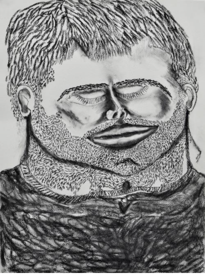
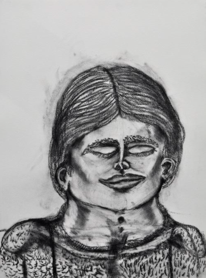
NB: It completely changed my work. We were asked to leave our studios in March 2020, and I found myself, like a lot of people, confined to my bedroom. I had been working on very large-scale, pastel works on paper, and suddenly, not only was that type of work physically impossible to create, but it also felt very irrelevant. All of a sudden I was working on notebook-sized pieces of paper at my desk in my bedroom. Like everyone else, I was doing a lot of doom scrolling and experiencing considerable anxiety about the unknown. So I ended up doing touch portraits.
RB: I saw those on your website. I wanted to ask you what got you started on those and what they signify.
NB: Touch portraits helped me get through that first lockdown in terms of mental health and productivity. Just a quick note on touch portraits: I was taught how to do them when I went to Rhode Island School of Design for a term after I graduated from the drawing school, and there was a really amazing teacher, Gwen Strahle. She taught us how to do these touch portraits, which are basically when you touch your face and draw what you feel under your fingertips rather than what you think you look like. I started doing them in January 2020 after setting myself a goal to do one daily, with the aim of expanding my mark making techniques. When lockdown hit, I continued to draw one a day. They were very personal, process-led drawings, so I was happily surprised when other people started to connect to them, too. I would play some music, and it was really the only hour of the day that I wasn’t incredibly anxious on my phone or listening to The Daily.
RB: The Daily during lockdown still haunts me.
NB: [Art] was a relief from all of that, which I’m sure you understand. It provided me with space during that time to be productive, but in the long term, it also made me very aware of texture and touch on the surface. In the You Are What You Eat show, all of the paintings were kind of born from those drawings.
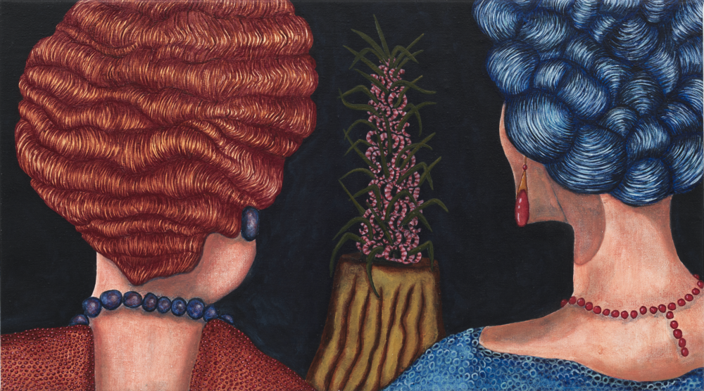
RB: It’s clear from You Are What You Eat that all of the patterns have almost risen off the canvas into textures, cloths and other things that you feel like you can reach and touch with your fingertips. What’s the connection here to your touch portraits?
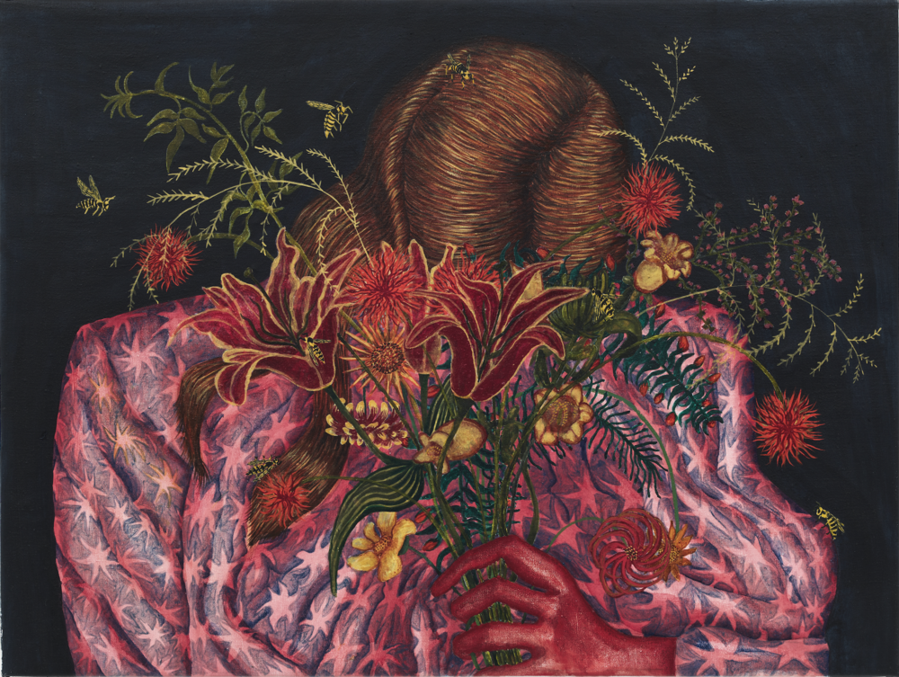
NB: For every single surface, rather than thinking, ‘What does it look like? How do I represent it visually?’ I’m always thinking, ‘What does it feel like?’ And if I lead with the feeling of texture and treat every surface with equal intensity, then it allows for this, as you described, beautiful ability for the viewer to, hopefully, imagine what it would be like to reach out and stroke the canvas or even exist within the painting. It really emphasizes the bigger scene that’s happening.
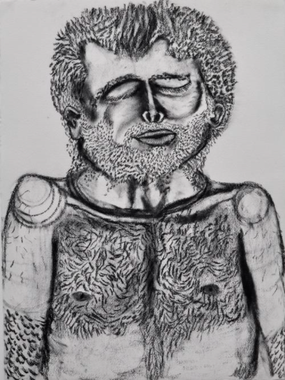
RB: I also think that in your work, we find textures in places that you wouldn’t expect, like a piece of clothing made out of human-like hairs. What do you think is the effect of abstracting the way that things feel?
NB: What I'm trying to do is invite the viewer in. I'm trying to create these surfaces that are alluring and seductive but at the same time a little bit revolting and strange. Some of the imagery within the paintings is quite familiar, like the things that you might interact with every day. So, it's kind of the idea of trying to ease the viewer in and then make them feel at home, but there’s something not quite right. I relate it to shame as well. Because often, especially with something like food, it can be thought of as seductive and delicious but also equally revolting.
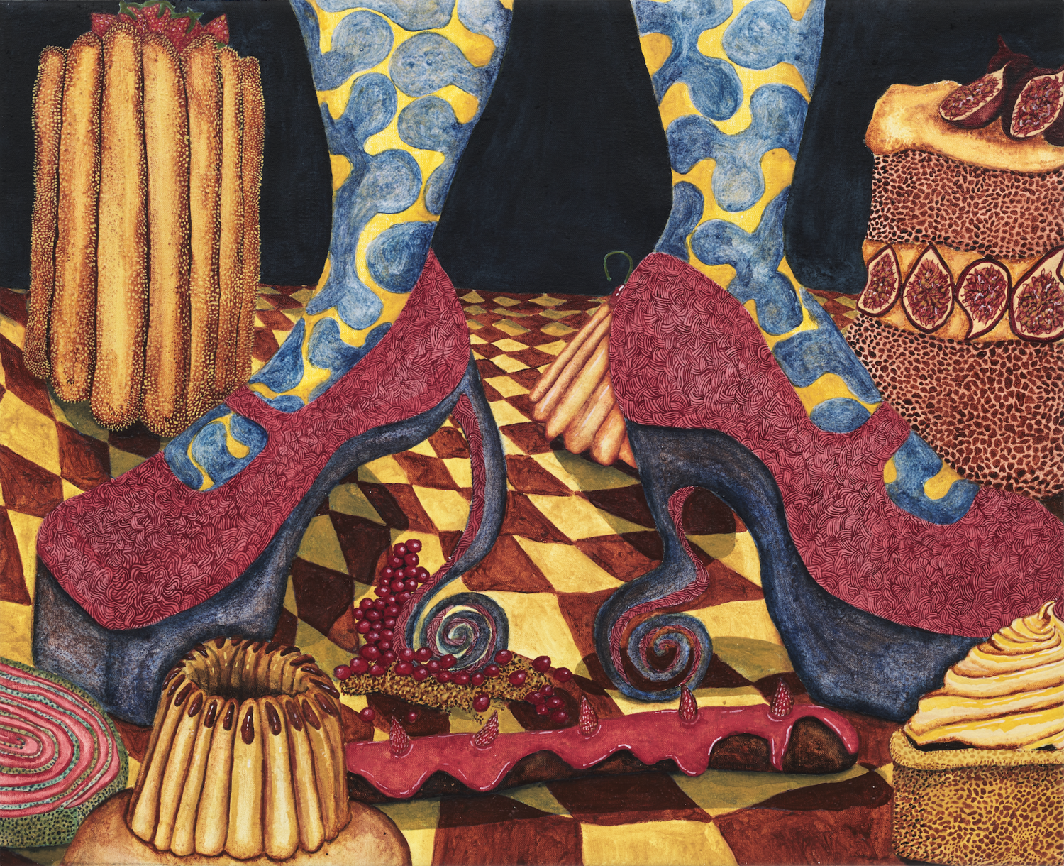
RB: I read on the gallery’s website that you took inspiration from some old Weight Watchers ads. I looked them up to see what they’re about, and I found them pretty brutal. How does your work speak to our interaction with food in the modern world and in those advertisements, especially amidst a pandemic, when the only interaction we really had with anyone was seeing their Instagram feeds, which are obviously highly curated.? Is there a connection between this idea and what you’re trying to get across to your audience?
NB: Absolutely. I was looking at these 1970s archival images of Weight Watchers advertisements, where the food is so eccentric — really bizarre prawn cocktails, a crown of frankfurters with cake and weird salmon souffles or jellies with bits of ham and fruit suspended within them. It’s just not appetizing.
RB: And it’s almost ironic that those are ads for Weight Watchers.
NB: I suppose in the Weight Watchers canon, what they’re saying is, “Look at this really fashionable and delicious but low carb, low calorie food!” There’s one painting that I did called This is Living, Not Dieting, which is a direct quote taken from one of their advertisements. [The ad] is this woman on a TV selling you really weird, bizarre yet kind of hilarious food, and she’s saying, “If you eat this, you can be just like me, you can have it all.” Even though it’s comical that these ads were ever serious, they’re incredibly relevant today. You're right; the message is this sense that everything is curated, and we’re always showing the best versions of ourselves, just like these women who seem almost like they’re screaming for help while someone behind the camera is coercing them into eating a crown of frankfurters.
This Is Living, Not Dieting!
RB: Now, there are so many little subtleties when it comes to comments about food and the way that our bodies should look, so it's really interesting to see how it was approached decades ago. Going back to the idea of textures, how do you achieve such dynamism and depth in your paintings?
NB: I make my own paint. I suppose that when you make your own paint, you have quite a close relationship with the pigment, and each pigment has different properties. Some of the pigments are naturally kind of glittery. If you were able to come to London and see the show, you would see that some surfaces are actually quite sparkly, and others are very opaque. Some are transparent. As you work with them, you begin to understand how some are shiny and some are matte. You begin to understand what’s going to do what, when to respect the pigment and not layer it and when the patterns that [certain paints] make must be very worked. The less paint you put on, the more the light can reflect back, so I’m always thinking about how the paint will look at the end.
RB: It’s almost like science.
NB: Yes, and I also often look at fifteenth century paintings at the National Gallery in London and think about their color. That influences what colors I choose as well.
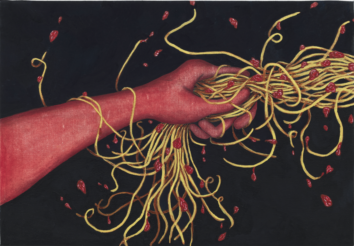
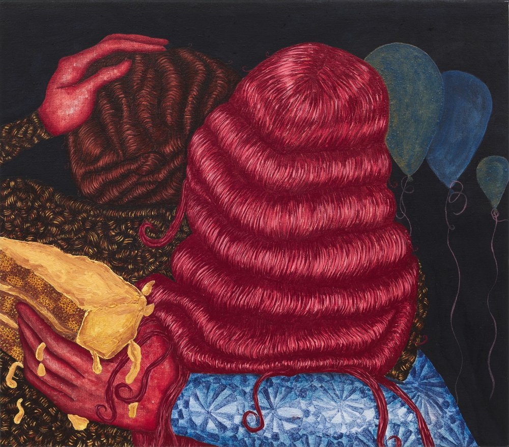
RB: I wanted to know more about the red hands present throughout almost all of the works in You Are What You Eat. I saw that [the red hands] started a bit earlier than this most recent show. What is their significance?
NB: Changing the color of the hands first started when I saw a couple holding hands while wearing surgical gloves as they walked through Brooklyn at the beginning of the pandemic. Everyone in New York was wearing gloves at the beginning because we weren’t sure how [the virus] spread. Seeing this couple, for me, indicated a change in society. So I started drawing gloves. I was getting more and more obsessed with hands, thinking about touch and touch portraits, and the fact that touch had become something that we longed for, but was also taboo, and that hands were these moments in between people or even in painting. But then they were also dangerous because they could carry germs or be dirty. When I went back to the National Gallery, I saw an Artemisia Gentileschi exhibition, and I noticed that my focus was going to the hands and the body language, and how much hand gestures could say. I wondered how I could turn the attention away from the face and towards the body language. And the hands became this glowing red, which is such a charged color. We all have associations with red, whether they’re related to sexuality, guilt, passion or danger.


RB: What was it like to work on these pieces simultaneously? Do you think that some of your pieces had the opportunity to interact with others and affect each other in certain ways?
NB: I have one lovely, big wall in my studio, where I have all the different canvases lined up against each other in a row. I set a timer so that I work on each one for maybe 45 minutes. I’m intending to keep them fresh and not get too precious, especially because there are so many patterns that you can get completely lost in. By doing that, they all begin to relate to one another. I always have some “finished” works up on another wall so that I can keep looking back and learning from my past, learning from my mistakes or things that worked. And what happens is that I tend to be using some of the same colors and patterns — for example, in That’s a Lot of Sugar, I use the same pattern for the shoes as I do for the rabbit in Hold The Line. There’s this sense, as you see them in the show, that the shoes become the rabbit, that’s then the same pink as the shirt in Hump Day, which is the same pink as the hair in Always Leave the Party Early. Is there a relevance to the repetition of colors and patterns or not? Either way, they begin to speak to one another, partly because of how they were made. In the gallery, they really take on a life of their own. It almost looks like you’re watching a film, that they’re scenes in the same story, especially because there's this very dark, theatrical backdrop and then very vibrant colors at the front. It looks like there’s a spotlight on the characters.
RB: It almost puts them in a position to make them all part of their own universe. One that is even more absurd [than ours], highlighted by the fact that the rabbit and the shoes are the same texture and color, whereas in our reality, that would never happen.
One more question: If anything, what is the one idea you would want your audience to take away from these pieces or to take away from this body of work in general?
NB: I would think that the work has been successful if they somehow see a mirror to their own world from the work. They walk in, and they recognize something about their own life, but they see it differently. That would make this work a success.